
If your OTOBO installation still wears its default blue-and-grey theme, you're not just missing a cosmetic upgrade — you're sending a quiet signal to every customer and agent who uses it. Here's why that matters, and how a five-minute change fixes it for good.
Open ten different companies' OTOBO helpdesks and, more often than not, you'll see the same interface ten times over. Same blue header. Same grey sidebar. Same default logo placeholder. It works — OTOBO is a genuinely solid open-source ticketing platform — but it looks like nobody's home.
That's the part that's easy to overlook when you're focused on getting tickets closed and SLAs met. The software running your support desk is also, whether you intend it to be or not, part of your brand. And right now, for most OTOBO users, that part of the brand is invisible at best and generic at worst.
Think about everywhere else your company's identity shows up. Your website is branded. Your emails have a signature and a colour scheme. Your invoices carry your logo. Even your out-of-office auto-reply probably mentions your company name in a font someone chose on purpose.
Then a customer raises a support ticket, logs into the portal, and lands on an interface that could belong to literally any other business running the same open-source platform. There's no visual thread connecting that experience back to the company they're actually dealing with. It's a gap — small on its own, but it adds up.
The same is true internally. Agents spend hours a day inside OTOBO. It's arguably the tool they interact with more than almost anything else in their working day. When that tool looks like a stock template rather than something that belongs to the company, it's a missed opportunity to reinforce identity and culture in a space where your team actually lives.
Every touchpoint a customer has with your business shapes how much they trust it. A support portal that looks unbranded and off-the-shelf sends a quiet but real signal — and it's the same reason companies bother branding invoices and email signatures in the first place.
by Paul Stanbra
It's not that IT teams don't care about this. It's that fixing it has traditionally meant one of two unappealing options.
OTOBO's front end is built from Perl templates and Skins packages. Recolouring it properly — not just a CSS override that breaks on the next upgrade, but a real, maintainable rebrand — means someone comfortable digging into the underlying templates. That's a specialist job, it costs real money, and it's rarely anyone's top priority when there are tickets to triage.
The lower-effort route is a manually pasted stylesheet override, injected somewhere in the config. It sort of works, right up until the next OTOBO update ships and quietly overwrites or breaks it. Now someone has to remember what was changed, dig up the old CSS, and redo it — and that's assuming anyone kept a copy in the first place. In practice, a lot of these overrides just get abandoned after the second or third time they break.
Both routes share the same underlying issue: rebranding OTOBO has never really been treated as a first-class, supported feature. It's a workaround bolted onto a system that wasn't built with it in mind.
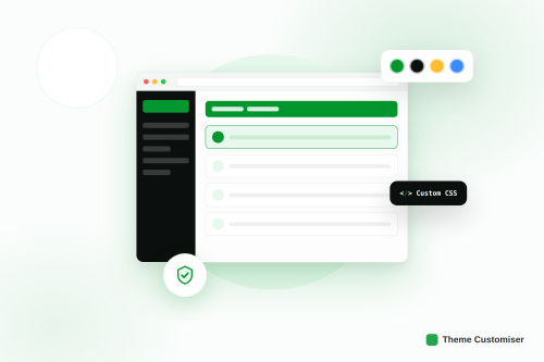
Theme Customiser exists because that gap seemed like an obvious one to close. Rather than treating rebranding as a one-off developer task, it turns it into something any OTOBO administrator can do from inside the Admin panel — no template editing, no CSS hacking, no external tooling.
In practice, that means an admin can pick a colour palette (or start from a ready-made preset), upload the company logo, and optionally drop in custom CSS for finer control, and see it applied across the whole agent interface in a few clicks. What used to be a developer ticket becomes a five-minute task somewhere between "update a setting" and "change a profile picture."
The CSS-hack approach doesn't just make rebranding harder to start — it makes it fragile to keep. That's the part that came up repeatedly while building this: what's the point of a rebrand that quietly vanishes the next time OTOBO gets patched?
So colours, logo, and custom CSS are captured and automatically backed up as part of the plugin's own configuration, and restored through every install, update, and reinstall cycle. An OTOBO upgrade shouldn't mean redoing your branding from scratch, and with this in place, it doesn't.
Not every organisation needs just a single colour scheme. Managed service providers running OTOBO for multiple clients, businesses with seasonal or campaign branding, or teams who just want to A/B test a redesign before committing to it all benefit from being able to save several complete presets and switch between them instantly, rather than reconfiguring colours and logos from scratch each time.
What's includedNone of this is about vanity. A rebranded helpdesk isn't just nicer to look at — it's a small, consistent signal, repeated across every ticket and every login, that the organisation on the other end is deliberate and professional about the details. For customers, it builds a bit more trust in a channel that's often their only direct line to your business when something's gone wrong. For agents, it turns a tool they use for hours a day into one that actually feels like it belongs to the company they work for.
It's a small change to make. It just needed to stop requiring a developer to make it.
Theme Customiser installs as a standard OTOBO admin package. Licence keys are issued instantly and locked to your domain.
Get Your Licence →Perpetual and annual licensing available · single-domain licences from £39
When you subscribe to the blog, we will send you an e-mail when there are new updates on the site so you wouldn't miss them.
© SysFix IT Support Ltd, 2003-2026
VAT Number: GB 206 7821 12
Company Number: 09416191